GodReign Dreamworks logo 1
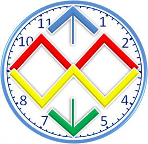
Since dreams and works has a timeframe, that is why clock was added to the existing God Reign Networks logo, and both the World and the Imaginary lines was removed to conform to GodReign Dreamworks standard.
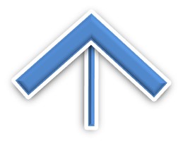
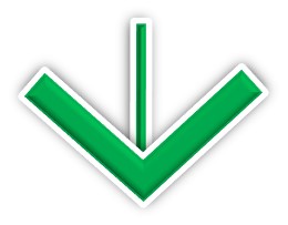
The Crest
and the Trough in God Reign Networks logo
was also transformed to up
and down arrow keys/navigation buttons respectively in GodReign Dreamworks logo, which explains that your dreams and your works will determine whether you will be at the equilibrium point, moving backward, or moving forward.
While this in the middle symbolizes the instructions to follow and sacrifices you have to make in order to make your Dreams come to actualization.
This also symbolizes ‘M’ in dreaM
and this symbolizes ‘W’ in Works.
Then, this in the broad sense means the point when your Dreams are applied in works to be actualized.
GodReign Dreamworks logo 2
In June 2017, while looking for the short form of GodReign Dreamworks, I discovered that GoRed will be suitable for the short form.
After finding GoRed as the short form, then I discovered that all my existing logos are not suitable for the short form of the name. then there is need to create logo that will fit GoRed. I solved the puzzle by creating several logos with time.
All these logos expresses the short form and symbolizes GOING TO RED. They even show those colours you are likely to meet on the road while going to Red.
After a lot of screening, I discovered that I need to present the logo in a simple way, but speaking about 3D since am a 3D Artist.
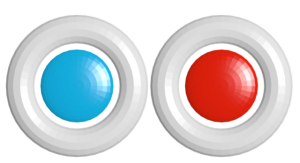
While thinking of the simple way, I imagined having just 2 Buttons controlling several options.
These 2 buttons with Blue and Red represent the 3D of life. Looking at the 3D glass, it only contain Blue and Red.
After accomplishing this, then I discovered that having 2 buttons is good, but the 2 buttons can be replicated in several ways to suit the purpose at the moment of use.
Also read Colour Speaks


